Mima's Pizza Mobile App UX/UI Case Study
Pizza Ordering App Case Study - By Eric Amankyim
This was an all-encompassing design process. The full design process of researching, building, and improving was used to create a full experience design for an app that allows customers to order takeout/delivery from Mima Pizza Place.
Role
There were no other designers involved in this design. I completed everything from the research to wire-framing to creating the high-fidelity mock-ups. I also managed the full branding aspect.
See how I completely revamped the way costumers order at this restaurant.
Mima had a problem in that it was insanely hard to order food online. It took too long and was very confusing. Providing a great experience that is accessible and inclusive of all customers was a challenging task.
Research to identify the problems users are facing
In order to find out what problems users were facing ordering pizza, I conducted interviews. The User groups come from a wide range of demographics, but we focused on working adults who order pizza for their families. Additionally, young adults ordering for siblings or friends. People in the community were asked if they ordered online, and if they replied yes, I asked about problems they had encountered.
Users Pain Points
Functionality: Occasionally, the mobile website crashes, forcing the user to start the process over. Leaving users extremely frustrated
Accessibility: The website is not very accessible to all users. The text is hard to read and navigation is difficult.
Information Architecture: The site has very few pictures, everything is text-heavy, making it very difficult to navigate through. In addition, users cannot see a picture of what they are ordering and make an informed decision.
Time: The process took too long for many people who wanted to order food quickly.
Problem Statement
Daniel, a visually impaired man whose family loves to eat pizza who needs a quick and accessible way to order pizza for the family. So that his family and himself can enjoy their favorite food without the stress of ordering it.
Solution
In order to come up with a solution that truly helped solve the problems the restaurants faced, I needed to understand more about the restaurants users I started out by creating user personas to personalize the experience.

These personas helped me personalize my research and organize my documentation so that all of our costumers' needs are at the forefront of all design thinking for this project.

These personas enabled me to design these designs with accessibility needs in mind.
Competitive Audit
I decided to conduct a competitive audit to try and gain an understanding of what this design project will entail. With the help of a competitive audit, I was able to discover what the competitors were doing well and poorly and tailor those things to the experience I wanted to provide to our customers.


Takeaways from the competitive audit
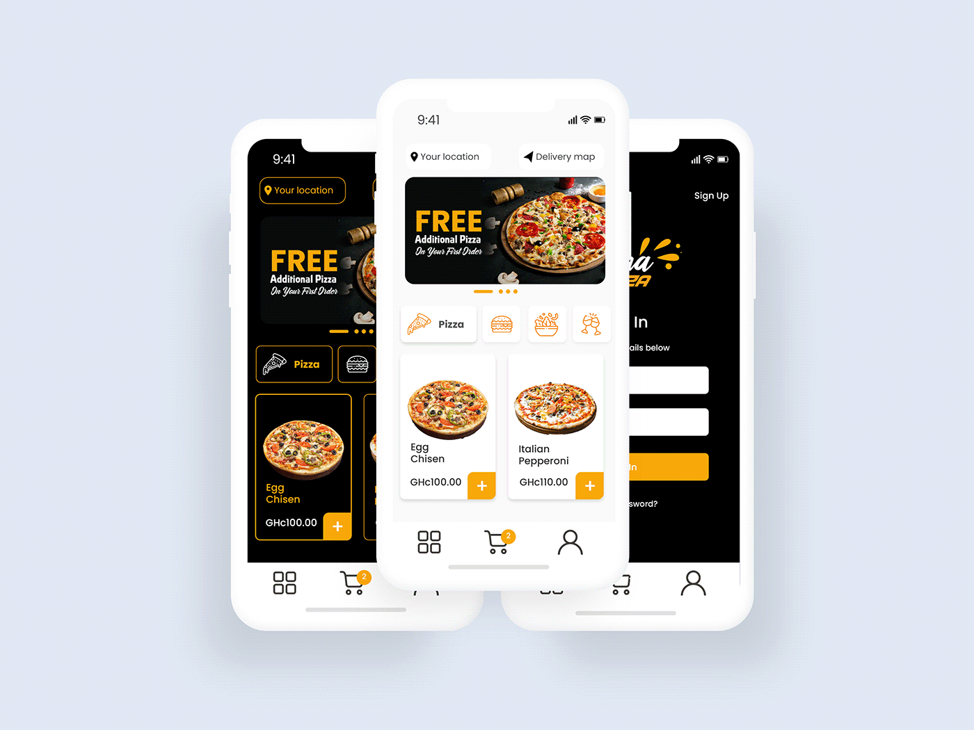
1. In almost all cases, the websites and mobile applications of food restaurants display the image of the food ordered.
2. Allow users to place their orders as efficiently and quickly as possible.
3. Have a way for users to record what their favorite order is or what they prefer to order.
User Journey Flow
The first step I took before sketching and building mock-ups and wire frames was to understand what the user would experience when using the application. Journey maps were the most effective method for finding this

Design
After I completed my foundational research, I felt ready to begin sketching and creating low-fidelity mock-ups to determine the general look and feel of the app.
WIREFRAMES


These wireframes were made to provide a visual representation of the proposed design. This allowed stakeholders to understand the overall layout and functionality of the product. This enabled clear communication between designers, developers, and clients, reducing the likelihood of misunderstandings and errors.
In the wireframing process, the focus was on the functionality of the product without being distracted by aesthetic concerns. I ensured that the user's need were met and that the product is optimized for usability.
I was pleased with how these turned out, but now it was time to see what our users thought of them, so I started to began my first usability test.
Usability Test #1
My data collection method will be to do an unmoderated usability study where I will send them a prototype and ask them to record themselves as they use my app. During their use of the app, they can record notes and emotions.
Initial findings from our usability test
1. Users need a working way to customize pizzas.
2. Users would like the profile feature to work and be able to customize appearance
3. Users would like an auto complete function on the location page.
Usability Test #2
I then set out to create the designs I would show our users for the second usability test. There we discovered many different things
1. Users wanted the app to offer additional product features. These products were soft drinks, water, burger since they can't order just Pizza on the app and order other additional accompainiments from somewhere else. I discussed this with stakeholders and we decided to add that feature.
2. Users wanted to the app to prompt them to order accompainiments if they forget to order. This shoud appear before the final checkout page.
After Usability Test, Add Extras button was added to the checkout page. This button would appear when the app detects user did not add any accompaniments to his or her order.

There was the need for the extras to show on the homepage for users to provide her visibility for users. Some users may not even visit the app to buy Pizza but drinks and burger.


Accesibility Consideration
I took these steps to solve one of the major issues with this restaurant ordering system:
1. In order to make the app more accessible to our customers, we decided to integrate the language feature into the profile page so that users can customize it to the language they prefer.
2. We added a usability setting on the profile page that allows users to choose if they want different accessible features such as screen readers.
We decided to change the old way of ordering food through Mima's Pizza app by adding more images and making ordering easier.
Final product Prototype
Final Designs
The time had come to finalize my designs.
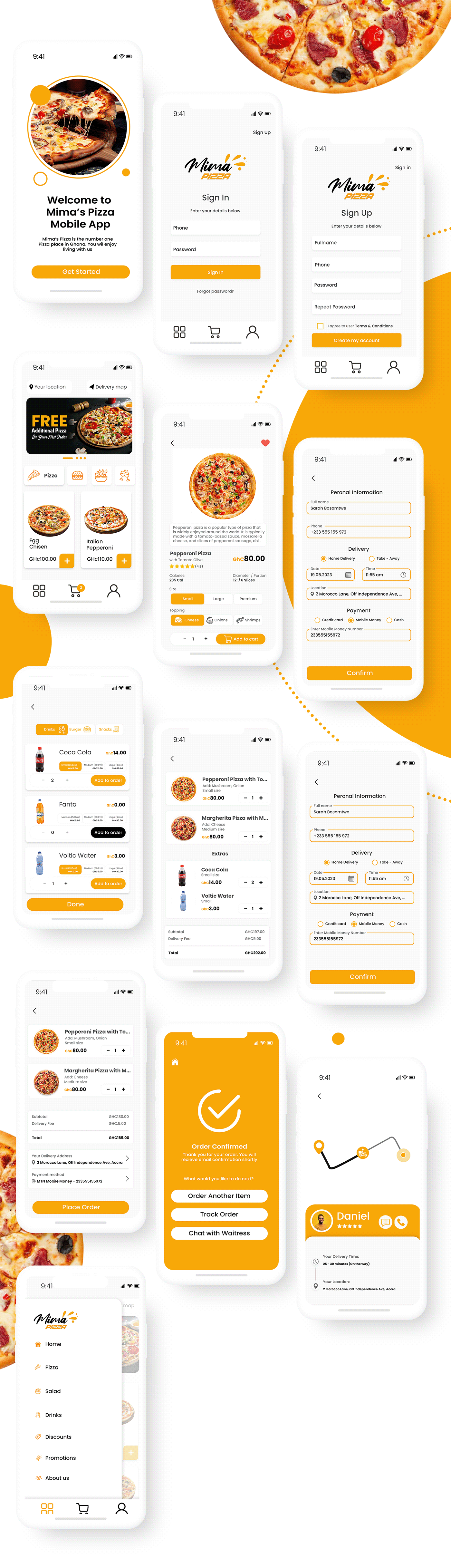
DARKMODE

THANK YOU FOR READING
